End of Life Choices New York advocates for quality of healthcare, healthcare choices, and human rights, allowing for autonomy, justice, and the relief of suffering at the end of life.
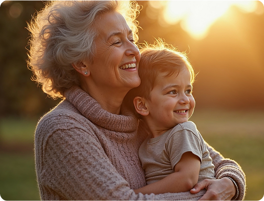
Few topics are more taboo than death and dying — and yet they are natural parts of the human journey. Through support, education, outreach and advocacy, EOLCNY helps New Yorkers approach life’s end with dignity and choice.
End of Life Choices New York needed a visual identity capable of changing how people perceive some of society's most sensitive topics: death, autonomy, and end-of-life decision-making.

Their existing logo felt clinical and outdated, and wasn’t conveying education, support, or dignity—traits with which they’d become synonymous.
They needed a mark that could unify all the pillars of their work—education, resources, and advocacy—while remaining tasteful, recognizable, and accessible. The challenge was to express trust, choice, and compassion in a single visual system that could soften stigma and invite people into the conversation.
Our exploration focused on how a visual identity could embody EOLCNY’s core themes: compassion, education, autonomy, and dignity. We examined a range of directions, from interlocking hearts—which conveyed care but leaned too heavily into healthcare—to symbolic forms that suggested learning, storytelling and the many paths available at the end of life. We sought a mark that could work across all of the organization’s pillars and feel welcoming to an older audience, while remaining modern, recognisable and emotionally grounded.
This process led us to the open-book concept: a versatile symbol that evokes education, life’s narrative arc, and multiple options or choices. The radiating pages communicate movement and leadership in advocacy, while subtly referencing the idea of a story concluding. Placing a heart at the center brought forward the human connection at the heart of EOLCNY’s work. By unifying all elements into one continuous form and refining the palette and typography for warmth and accessibility, we created a visual identity that lifts the viewer “into the living room,” away from the stigma and fear typically associated with this topic.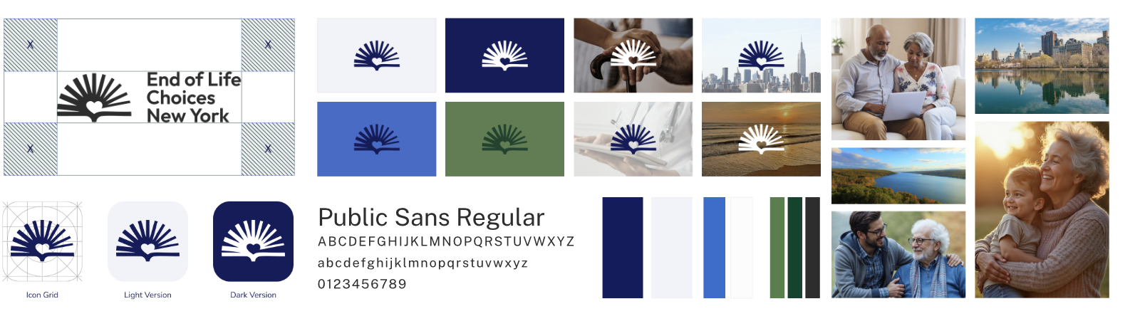
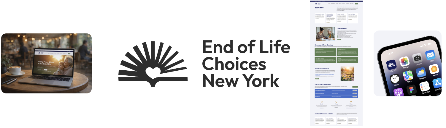

This was the best marketing team we ever worked with; their redesign of our website was phenomenal and really put our mission on the map.

Drop us a line. We'll discuss your goals and start you on the path to building the influence and infrastructure your mission deserves.